Remember California Sunsets
Rebranding the visual identity of the iconic amusement park that defines the Santa Monica Pier
Rebranding the visual identity of the iconic amusement park that defines the Santa Monica Pier
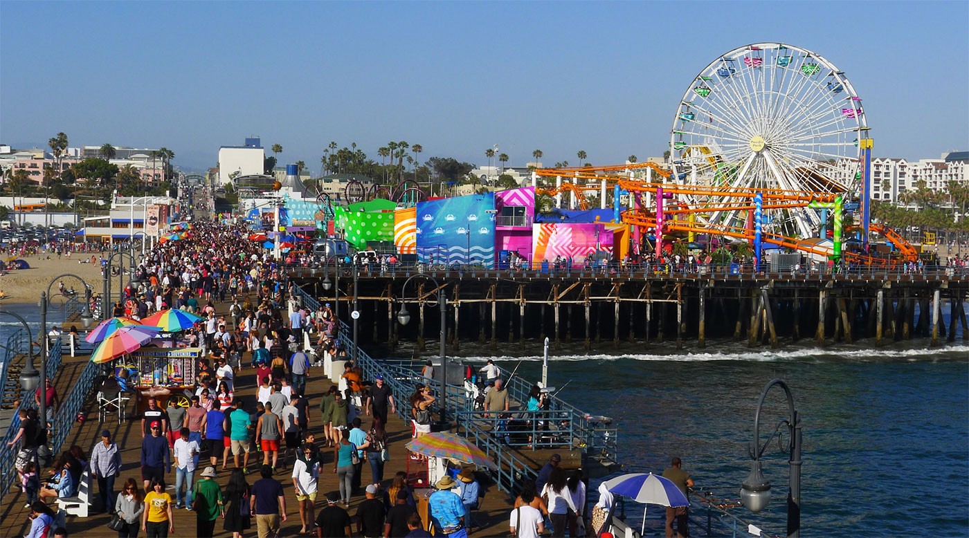
Pacific Park, the iconic amusement park whose silhouette defines the Santa Monica Pier, challenged us to radically update their visual identity. Faced with the monumental task of breathing life, gravity and weight into this great American icon, our team focused on one goal: create an unforgettable visual impression of the Pacific Park and charge it with the power to delight future visitors by the billions.
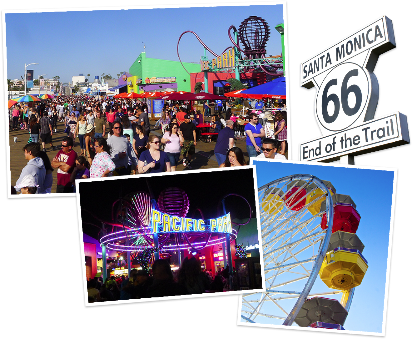
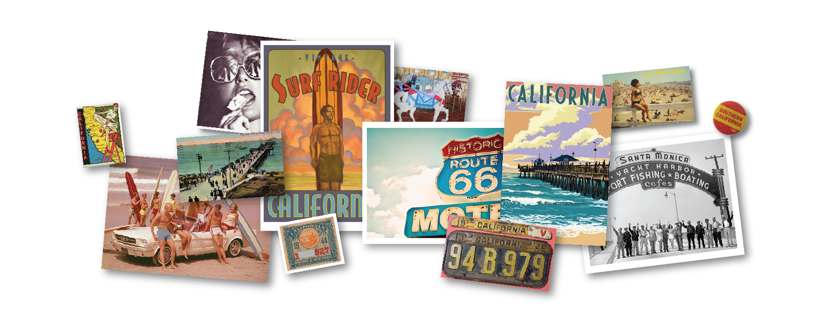
How do you rebrand an icon? We mined countless historical references - books, movies, posters, songs - which all refer to the park as the end of Route 66. A place you find when you follow the sun to the end of a road trip. On our many visits, as we soaked in the warmth of the sun and the smell of the surf, we envisioned a vibrant new direction steeped in nostalgia.

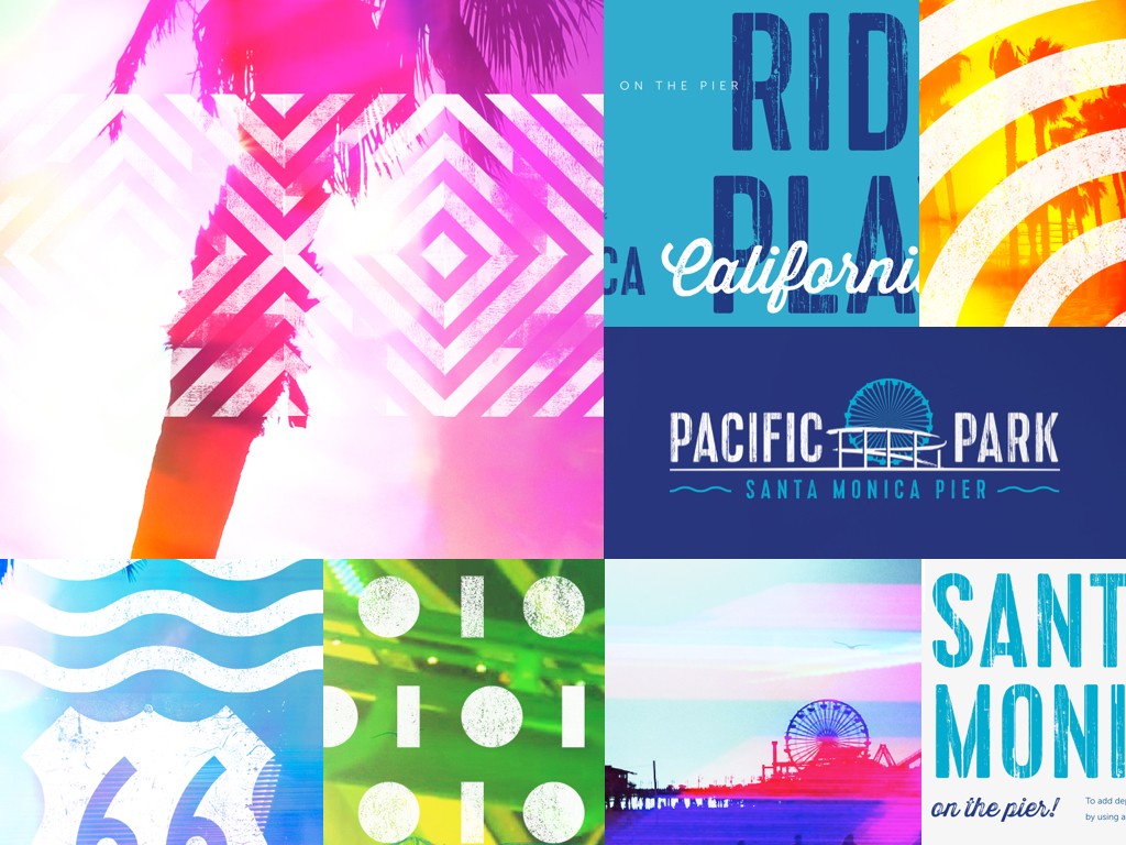
The ferris wheel is the most dazzling element of the pier. We placed it center stage in the logo design, just as it is on the skyline. As the sun sets, the wheel ignites an electric rainbow, basking its surroundings in an aura of color.

Between the warm hues of the Los Angeles sunset, bold patterns of midway games, and the multi-color wonderland that emerges after dark, vibrant is the only word that does the park justice. We captured those impressions in a visual language that feels like a playful memory.
We crafted a vibrant, soulful rebrand of Nashville's most treasured performance venue.
We rallied the world's largest LGBT community organization around an inspired message and identity.
We told an inspiring story about a trailblazing lab instruments company who invented an industry.
We repositioned a business-facing aerospace R&D company to become a consumer product leader.
We renewed the most legendary stage in the country music with a bold new brand and digital presence.